
The interplay between screen resolution and display scaling in online experiments
The challenge
When running an online experiment with images it is often important to have some control over the size at which the image was displayed. One reason is that we want to avoid images that are too large for a particular screen resolution so that a participant does not have to scroll to see the whole image. If a participant does need to scroll, this might affect how he perceives the image and can be a source of noise that needs to be avoided. Even if the image is visible as a whole, we also want to avoid that a participant needs to scroll to see user interface components such as task instructions and response buttons.
A possible solution
In jsPsych, we can use the browser-check plugin to evaluate properties of the device that is used by the participant. For example, width and height values can be provided to make sure that the resolution of the display window corresponds to a minimal size. In the example below, we show the result of a single jsPsych trial displaying an image. The height is fixed at 756 pixels. We perform a check to make sure that the minimum browser height is 800 pixels. Since the resolution of the monitor on which the experiment runs is 1920 x 1080 pixels this test does not fail.
// Display an image
const image_trial = {
    type: jsPsychHtmlKeyboardResponse,
    prompt: "Displaying image. Device pixel ratio: " + window.devicePixelRatio,
    stimulus: '<img style="height: 756px" src="IMG_20240118_083418.jpg">'
}

// Check browser window
var check_trial = {
    type: jsPsychBrowserCheck,
    minimum_width: 1000,
    minimum_height: 800
};
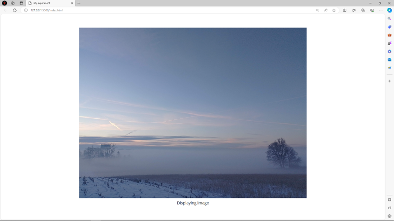 A nice looking trial!
A small caveat
At least on Windows computers, it is possible to configure the scaling of content on a monitor. When set to 100% all is fine, but larger scaling values will zoom in on the content of your monitor. The problem with this scaling setting is that it does not affect the resolution of your monitor. As a consequence, you might check the resolution in your experiment which will show up as being ok, but on a scaled monitor the content will actually take up more place than you suspect. The following screenshot is from the exact same experiment (displaying an image and performing a browser check) but with display scaling set to 150%. The same behavior can also be observed when zooming in the browser window itself.
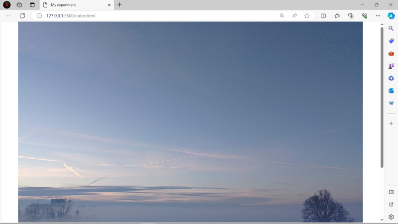 This should probably not be presented to a participant
Checking scaling
The JavaScript Window interface provides a 'devicePixelRatio' property. This value represents how many physical pixels are used for each CSS pixel. Think of it as how many pixels on your monitor are used to draw a single pixel of an image. Ideally, this should be equal to one. Higher values indicate that more physical pixels are used to represent a single image pixel.
As a possible solution, we could alert the participant about potential scaling issues before they start the experiment. In the code below, we have done this by looping a trial until the devicePixelRatio is equal to 1.
var check_pixel_ratio = {
    type : jsPsychHtmlButtonResponse,
    stimulus: function(){
        if (window.devicePixelRatio == 1){
            return "<p>Your screen appears fine!</p>";
        } else {
            return `<p>We detected a possible scaling issue. Please check the following issues</p>
                    <ul style='text-align:left'>
                        <li>Check if the web page zoom is 100%</li>
                        <li>In your computer display settings, make sure display scaling is at 100%</li>
                    </ul>`
        }
    },
    choices: function(){
        if (window.devicePixelRatio == 1){
            return ["Continue"];
        } else {
            return ["Check again"];
        }
    }
}

let loop_node = {
    timeline : [check_pixel_ratio],
    loop_function: function(data){
        return window.devicePixelRatio != 1;
    }
}